Customer Satisfaction Report
Customer Satisfaction Report
The customer satisfaction report gathers information obtained from the “customer satisfaction” tool, which aims to analyze the messages sent and received in conversations with your customers, categorizing them as positive, negative, or neutral.
The report presents the following graphs and percentages:
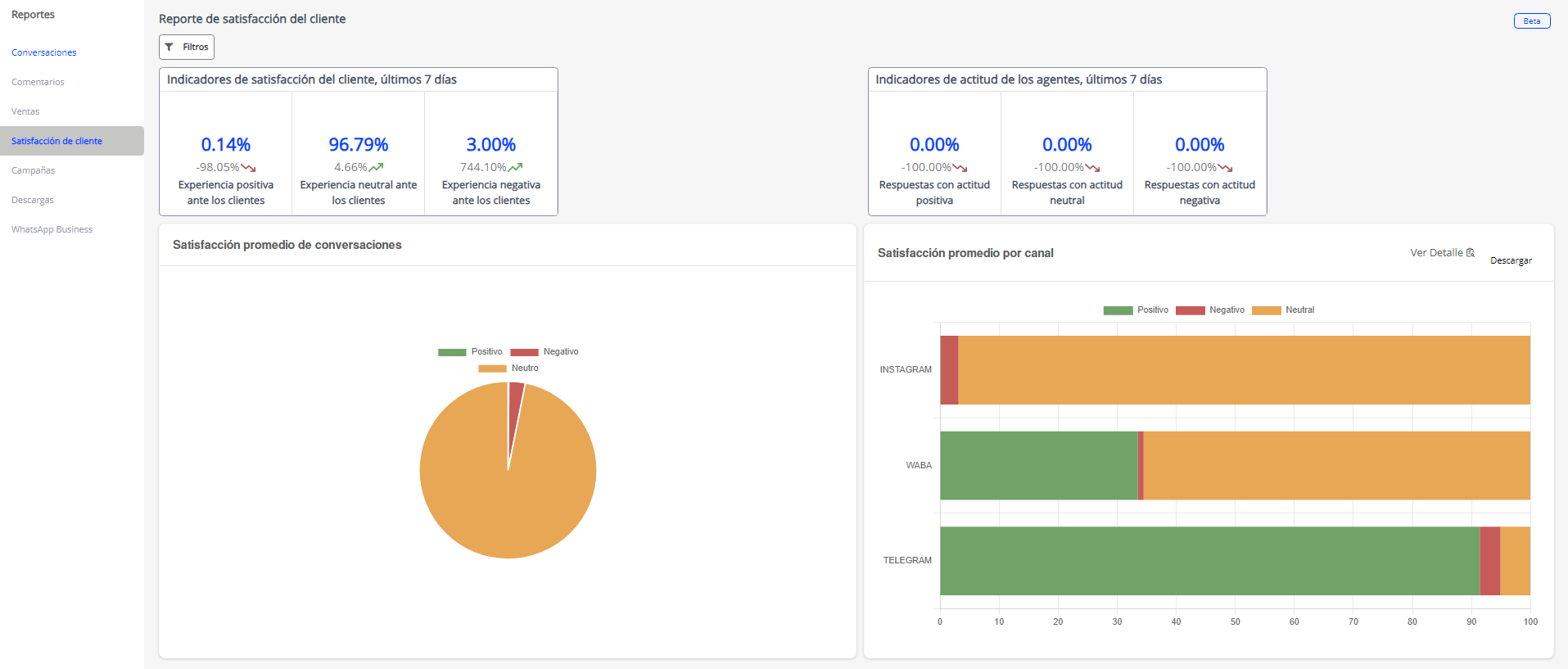
Customer satisfaction indicators, last 7 days
This report provides a summary of interactions with customers over the past 7 days, highlighting both the current situation and variations compared to the previous period. The numbers highlighted in blue represent the current percentages, while the numbers in gray below indicate the variations from the previous week.
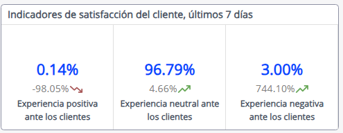
In the context of the example image, the data reflects that over the past 7 days, there were 35% positive experiences, 60 neutral experiences, and 3.20 negative experiences from the customer.
The values located in the lower section of the report show the specific changes that have occurred compared to the previous period. In this case:
- Positive experiences from the customer experienced a remarkable increase of 291%.
- Neutral experiences decreased by 32%, indicating a reduction in the neutrality of interactions.
- Lastly, negative experiences increased significantly by 744.65%, suggesting the need for special attention and a detailed review of negative interactions.
This report provides a quick and effective overview of the evolution of interactions with customers over the past week, which can be useful for identifying trends and areas for improvement in customer communication.
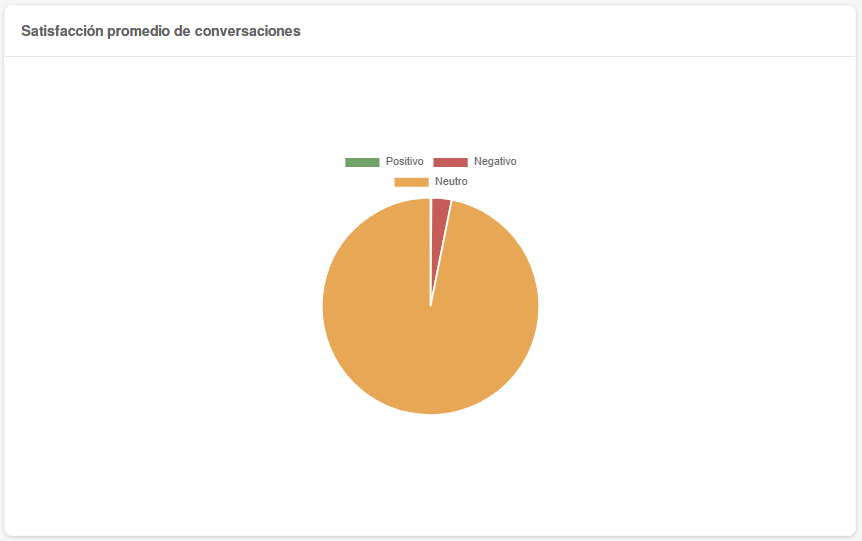
Average Conversation Satisfaction
This report provides a graphical representation of the average satisfaction in conversations with your customers, categorized into three segments: positive, neutral, and negative. Percentages are displayed when hovering over each sector or color corresponding to each category.
In this pie chart, you can visualize how satisfaction levels are distributed in your conversations with customers, allowing for a quick understanding of interaction dynamics. The identifying colors of each category will help you easily identify the proportion of positive, neutral, and negative conversations on your platform.
Agent Attitude Indicators, Last 7 Days
This report provides a summary of interactions with customers over the past 7 days, highlighting both the current situation and variations compared to the previous period. The numbers highlighted in blue represent the current percentages, while the numbers in gray below indicate the variations from the previous week.
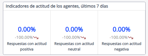
In the context of the example image, the data reflects that over the past 7 days, there were 17.35% positive responses, 75.63% neutral responses, and 2.45% negative responses from the customer. The values located in the lower section of the report show the specific changes that have occurred compared to the previous period. In this case:
- Positive responses decreased by 81.85%.
- Neutral responses increased by 1631.52%.
- Lastly, negative responses increased significantly by 5223.68%, suggesting the need for special attention and a detailed review of negative interactions.
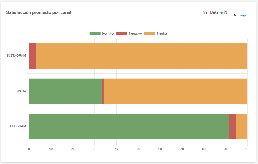
Average Satisfaction per Channel
The following bar graph displays the number of responses your customers have received in relation to each of the social media platforms or channels connected to your account. The graph is divided into three categories: positive, neutral, and negative responses.
You can obtain precise information about each of these categories by hovering over the bar of your interest. This will allow you to understand in detail how responses have been evaluated on each social media platform or channel.
